Posts about Visualization
August 24, 2023
Comparing and constrasting the differences in biking and transit times to downtown Calgary and downtown Toronto
August 30, 2022
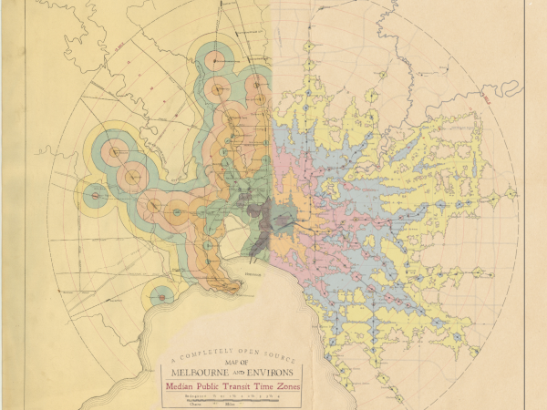
I decided to try my hand at updating a 100-year-old map of transit travel times in Melbourne.
January 27, 2022
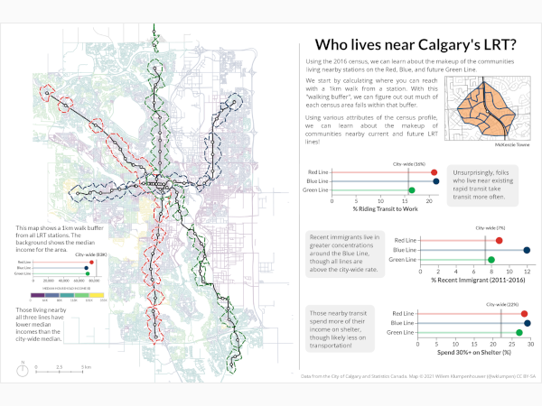
An "artist's statement" on a visualization of the distribution of nearby residents to stations on Calgary's current and future LRT network.

July 14, 2021
Despite reliability being at or near the top of what's important to passengers and data that is commonly available, transit agencies lack nuanced and detailed reporting on reliability. Here are six visualizations that can help communicate the reliability of a route better.

April 27, 2021
Dot maps are a great way to show many facets of a population in a dense area.


December 01, 2019
A data-driven exploration of VIA Rail's reliability in Ontario and Québec.

August 29, 2019
Introducing an application to quantify relative 'transit freedom' in a city.

January 03, 2019
Visualizing rail tonnage flows in North America using an interactive chord diagram.