Aug. 30, 2022
Recreating a Transit Travel Time Map from 1922
Willem tries his hand at updating a 100-year-old map of transit travel times in Melbourne.
Isochrones: Maps of Possibility
One of the best ways to visualize what a transit (or any transportation system) has to offer you as a prospective rider is through the magic of isochrones. A typical isochrone (iso meaning "same" and chrone meaning time) map shows how far you can travel from a specified origin point over various time intervals, and can provide you with an understanding of what parts of a city can be reached within a reasonable amount of time. Two very popular and beautiful historical examples include a world-scale map of travel from the United Kingdom and this map showing travel times by rail and tram from the centre of Melbourne, Australia:
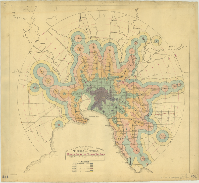
The original 1922 map of travel times on rail and tram in Melbourne, Australia.
I thought it would be an interesting exercise to create a 2022 version of this 100-year-old map to see what has changed, and also to have a little bit of artistic fun and see how closely I could reproduce the look and feel of the original map using only open-source software and analysis tools, and openly available data. Here's what I came up with:
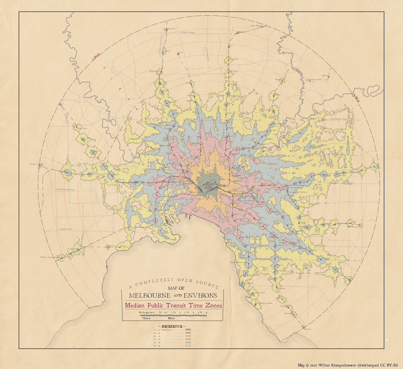
A 2022 map of transit travel times in Melbourne, Australia.
In the latter part of the article I'll talk about how I put the map together and some of the decisions made along the way, but first let's talk about some of the key differences between the maps.
Two Maps, Two Measures
Importantly, the two maps are actually measuring two different things in different ways, which I indicated by replacing "Tram and Railway" with "Public Transit" and "Minimum" with "Median" in the title of the 2022 map. The 1922 focused only on travel by regional rail or tram, and does not include other service such as buses (from what I can tell from this article motor buses weren't really a thing until 1925 anyway). In the spirit of updating both the data analysis technique and the technologies at play, the 2022 map includes all transit service, whether it be bus, tram, subway, or train.
The 1922 map also purports to show "minimum" travel times, which doesn't really capture the day-to-day or minute-to-minute variation in travel that's caused by scheduled service. It also assumes riders can walk in a straight line from a transit station out into the neighbourhood, which creates overly optimistic circular travel times around train stations. I used realistic walking distances along the actual Melbourne street network, which is why my map is more jagged than that from 1922. To account for variability caused by scheduled service (a tram every 10 minutes might include a 10 minute wait, or it might include no wait depending on when you leave), I took advantage of the features of the routing engine I used and used the median travel time over a 120 minute peak-period window between 7am and 9am on a Wednesday (August 24, 2022 to be precise). I am not sure what day of the week or time of year is represented in the 1922 map but I think it's fair to assume they used the "best" theoretical travel times possible.
In a response to my tweet of the maps, Liam Davies has suggested there may be other discrepancies in the methodology, including a rail service disruption during the week of the analysis, and the possibility that the 1922 analysis isn't actually from a single origin point but uses the entire central business district grid as an origin point. Our conversation was focused on inbound travel however, which in Melbourne doesn't always match outbound travel due to the City Loop. After our conversation I think the resulting analysis is somewhat pessimistic, but not overly pessimistic.
Slower Core, Larger Reach
Even with the caveats I just described contributing to these differences, I was quite surprised at the differences in the shape and extent of the same travel time isochrones. Take a look at the inner city: The 1922 map suggests you can reach the pier for the Spirit of Tasmania within 10 minutes, which the 2022 map suggests it will take upwards of 30-40 minutes. I suspect this is largely due to a gradual slowing of the tram service caused by growing car congestion and the addition of stops.
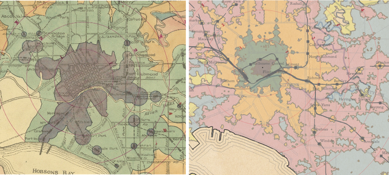
Downtown travel times from 1922 on the left, and 2022 on the right.
The overall reach of the network is larger however in 2022. The best example of this is the rail line running north from the northwest corner of the central business district, serving stops such as Goolaroo and Roxburgh park (Somerton on the 1922 map) which were otherwise not reachable in under an hour in 1922. These changes represent a shift away from faster core Melbourne travel by transit and towards commuter or regional rail service prioritization. There are also areas filled in by relatively good bus service, especially in the northeast portion of the city.
Making the Map
The goals of producing this updated 2022 map was twofold: See how things have changed over the past 100 years (both in technique and in service), and to demonstrate that with a little bit of legwork and some open-source tools, software, and data you can recreate these kinds of beautiful maps in a modern setting. While this won't be a step-by-step guide on producing your own version of this map, I wanted to describe how I put this map together and some of the thought processes and decisions that were involved. My hope is that you can be inspired to create these types of maps for your city - a map like this can be created for pretty much any city with published transit schedule (GTFS) data and some open source software, specifically QGIS, Python, and a little bit of GIMP or another image manipulation software.
Building a Study Area and Travel Times
The first step was to set up a working study area. I started by creating our point of reference layer at the intersection of Queen and Bourke in downtown Melbourne, and generated a 13-mile buffer (make sure to use an appropriate projection!) to create our area of analysis. Next, I needed some set of destination points, for which I decided to generate a grid of 50 metre hexagons over-top of the area before clipping everything down into a nice circle. Finally, I generated centroids from the hexagons to act as the destination points for travel time calculations.
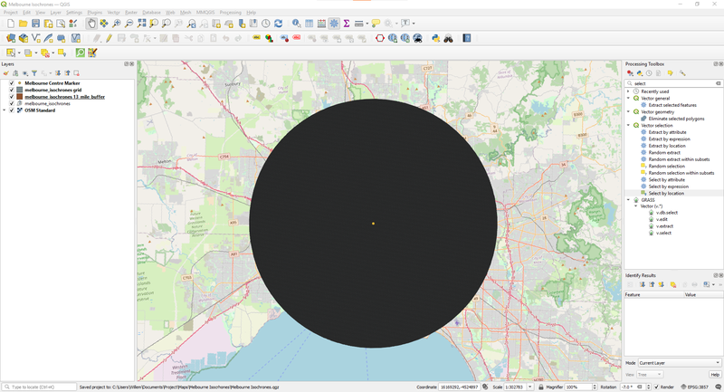
An ominous looking disc of hexes or Melbourne's next tourist attraction - time will tell.
To simplify things even further I went and found a shapefile with the outline of Australia, and used that to clip down the total number of hexagons to make our travel time analysis work as lightweight as possible.
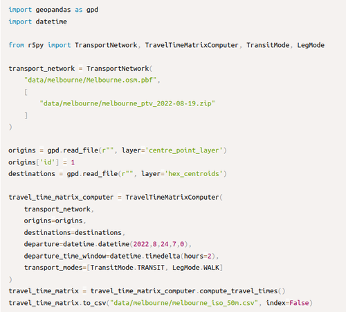
With the centroid dots generated to represent the destination points for our travel time calculation, and our city centre point representing our single origin, I made use of a fledgling Python package called r5py which is designed to wrap around the R5 routing engine, a very fast door-to-door travel time calculations that use public transit schedules and OpenStreetMap data as inputs. While r5py is in its infancy (so the code to do this may look different in the future), it is still able to run travel time calculations with a few lines of code:
Next, it's back over to QGIS to start visualizing the data. Because the IDs of the centroids (which I used to calculate travel times) and the hexagons match, I can join the travel time data into the hexagons and color them to get a first look at the data.
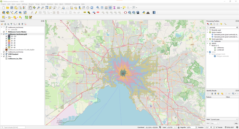
Our coloured hexagons over top of our OpenStreetMap background.
Assembling The Final Map
With the data analysis complete, the task was now to recreate the look and feel of the 1922 map as closely as possible. The first challenge is finding the datasets, especially for rail stations (I still have a pending data request into the Victoria Government for roads and railways), but I got around the data limitation by relying on OpenStreetMap: I used the Overpass API to query the location of railway stops and stations. Depending on how the OpenStreetMap is developed, this can result in a cluster of objects nearby sharing the same name (e.g. one for each platform or station entrance), which doesn't work for our simpler mapping purposes. To overcome this, I used the DBSCAN clustering algorithm that QGIS provides to group these clusters of stations together, and the "Mean coordinates" tool to generate a single point for each cluster. This layer became the basis for my railway stations, though it did require some manual addition of some station locations, and removal of some duplicates that escaped the clustering process. Pulling the railways from Overpass was a simpler proposition, and in both cases I was able to easily clip the layers to the 13-mile ring generated for the study area.
I used Overpass also for the roads, querying only major highways and arterials (I decided to leave the centre grid out for my map). Since OpenStreetMap provides directon-level detail, I was able to visualize these roads as wider paths by creating a simple line offset from the centreline. The river shapes are sourced from Australia's National Surface Water Information.
Next came fonts. After a pretty extensive search for a font that fit the map exactly, I settled on using a combination of "Leander" and "Portmanteau" fonts for labels, legends, and the title of the map.
Setting the default background colour for the project to a yellow-ish hue to match the original map background was extremely helpful in getting the visuals most of the way towards the map, but the final touches had to happen in the Layout Manager. I loaded in a couple of images of paper-like backgrounds and used a combination of opacity settings and the "overlay" feature to get a decent mix of folded paper feel and texture.
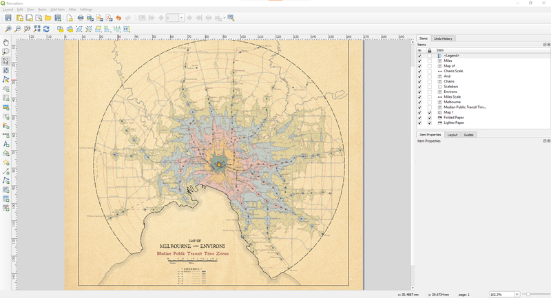
The layout manager in QGIS.
One thing I am particularly proud of is the scale bars. Using just the settings available in QGIS it was possible to recreate the look and scale of the bars both in miles and in chains (which required telling QGIS to make a scale in batches of 22 yards). While that may not be super helpful in a modern context, I very much like how it calls back to the original map.
The "reference" legend is also a carefully styled version of the standard QGIS legend. I shrunk down the boxes and fonts to the appropriate size, and re-named the labels for the different bins to match the original style. The nice thing about having the legend box set up automatically is that it captured the endless colour tweaks that I made during this final polish.
Finally, there were two things that seemed unavoidably manual: I had to create a separate point layer just for the ring distance labels (1-13), as QGIS didn't want to place the labels where the original map had them. QGIS also doesn't have a feature to create curved text labels, so the final "A Completely Open Source" banner over the info box was done using GIMP, an open-source image editing software.
Putting together a map like this is a fun analytics exercise, but it is also a labour of love. Trying to match the look and feel of the original 1922 map presented some unique challenges and pushed me to learn even more about QGIS than I had before.