July 13, 2022
Visualizing Populations with Dot Maps
How to see population distributions using messy data: Dots
I've been thinking a lot lately about ladders of abstraction, a concept formalized by S. I. Hiyakawa in his book Language in Thought and Action. He argues that humans think and communicate in varying degrees of abstraction or generalization, and that to have true and productive conversation about complex topics it needs to happen across multiple levels of abstraction. If you talk about an issue at a very high level (politicians love to do this) you end up washing out or ignoring a lot of information about individual experience or details about differences between groups affected by an issue. If you focus only on individual details, you miss out on understanding how individual actions make up a system, or how how a system must be designed to meet the needs of many different individuals.
Individual interactions with city services, whether it's catching a bus or turning on a faucet, can cause us to lose sight of the bigger picture, or worse: project our own experience and opinion about a service onto everyone else. Sitting in a planning office or at a city council meeting, it's just as easy to lose track of the individual in large budget decisions.
Good visualizations find ways to communicate information on multiple levels of abstraction. A viewer of a good visualization should be able to see both the forest and the trees, and be able to tell their own stories based on their experience with the topic at hand. Dot maps are a great way to see the individual and the collective at the same time.
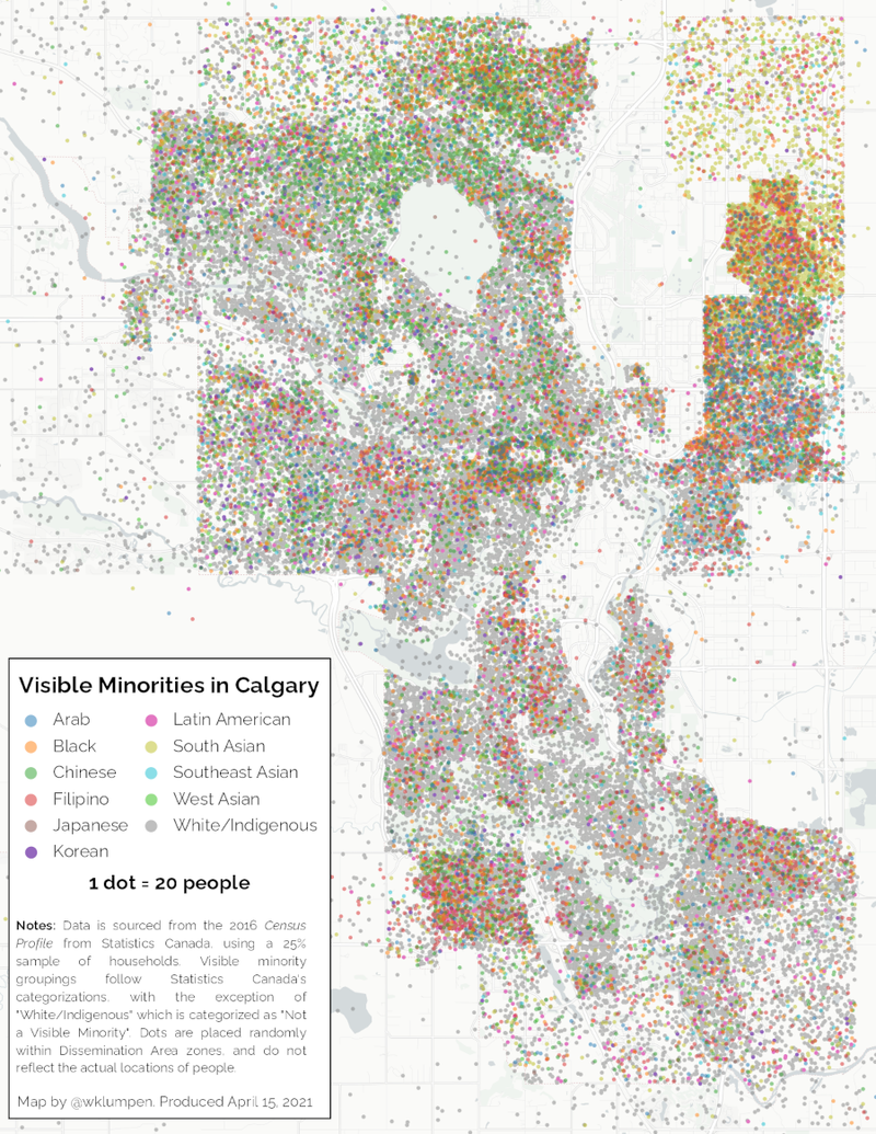
The premise of a dot map is that a certain number of individuals (say, 20) are represented geographically on a map with a single point (a dot), placed in some location that roughly estimates where this small group of individuals are located. These dots provide more fine-grained individuality than you would get through a traditional choropleth map, which colours an area based on a certain aggregate value. It also lets you style individual dots with different colours or shapes, meaning that you can represent a larger set of dimensions than you can with a choropleth map (which usually shows a single dimension, such as median income).

A dot map showing the distribution of visible minorities in Calgary, Canada.
In this article, I will walk through some of the steps I went through to create dot maps, using data from the Census Profile data product from the 2016 Canadian Census of Population, and an open source geospatial information systems (GIS) program called QGIS.
Wrangling Census Data
You can download bulk census profile information from Statistics Canada's website by broad region. To get as much geographic detail as possible while still having data available (the Census zeroes out small values to protect individual privacy), we are going to use the Dissemination Area geography definitions, which contain between 400 and 700 people.
Since I was focusing on Calgary, I downloaded and unzipped the file entitled Canada, provinces, territories, census divisions (CDs), census subdivisions (CSDs) and dissemination areas (DAs) - Prairies only. As the title suggests, it includes summaries for the entire country, the provinces, census divisions, subdivisions, and dissemination areas all in one file. I'm not sure why Statistics Canada doesn't separate by province or by geographic level, but in any case the file is huge, and contains a lot of information we don't need. Thankfully, I was able to read the entire file into a Pandas dataframe and do some cleaning. Here's the Python code snippet in case you'd like to see how the data was cleaned.
Points in Places
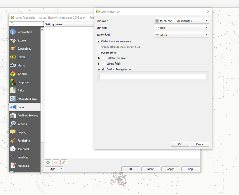
In order to generate dots within an area, we'll need data on where our Dissemination Areas are and what they look like. Statistics Canada provides downloads of spatial files here, which can be filtered down by province or joined with a dataset:

Joining our CSV files to Dissemination Area boundaries
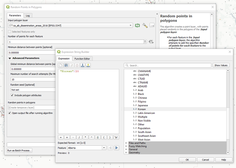
Now for the magic: The "Random Points in Polygons" tool (Vector > Research Tools) lets us (surprise) randomly place points in polygons, which in our case is our dissemination area file. The key is setting the "Number of points in each feature" value to a formula (little box on the right lets you select "Edit" under the expression heading. In my case, generated one for each demographic divided by 20:

Random Points in Polygons tool, with custom formulas.
Final Thoughts
There's some improvements that I'd like to make, including finding ways to distribute dots within an area according to land use information, for example from open street map. This would avoid the inevitable appearance of points in an airport runway, for example, or in the middle of a park. This would require writing a custom function.
Generating these dot maps using Census information is relatively simple, and can be easily adapted to other categories such as income, language, ethnic origin, or journey to work. I think decision makers should have many permutations of these maps in front of them while they make policy and funding choices for their cities.