Aug. 24, 2023
Comparing Biking and Transit in Calgary
Comparing and constrasting the differences in biking and transit times to downtown Calgary and downtown Toronto
Sometimes, inspiration for analysis and visualization comes when you're sitting at a park enjoying a nerdy discussion with friends. The topic of cycling and transit came up, and many of the folks around me expressed how biking for them in many cases is significantly faster than taking transit here in Calgary.
It just so happens that during that same week our little team over at r5py was finishing up an important update. R5py is a Python library that lets you very quickly and easily measure transit and other travel times. I also recalled that my friend Jeff Allen had put together a map of Toronto comparing cycling and transit times.
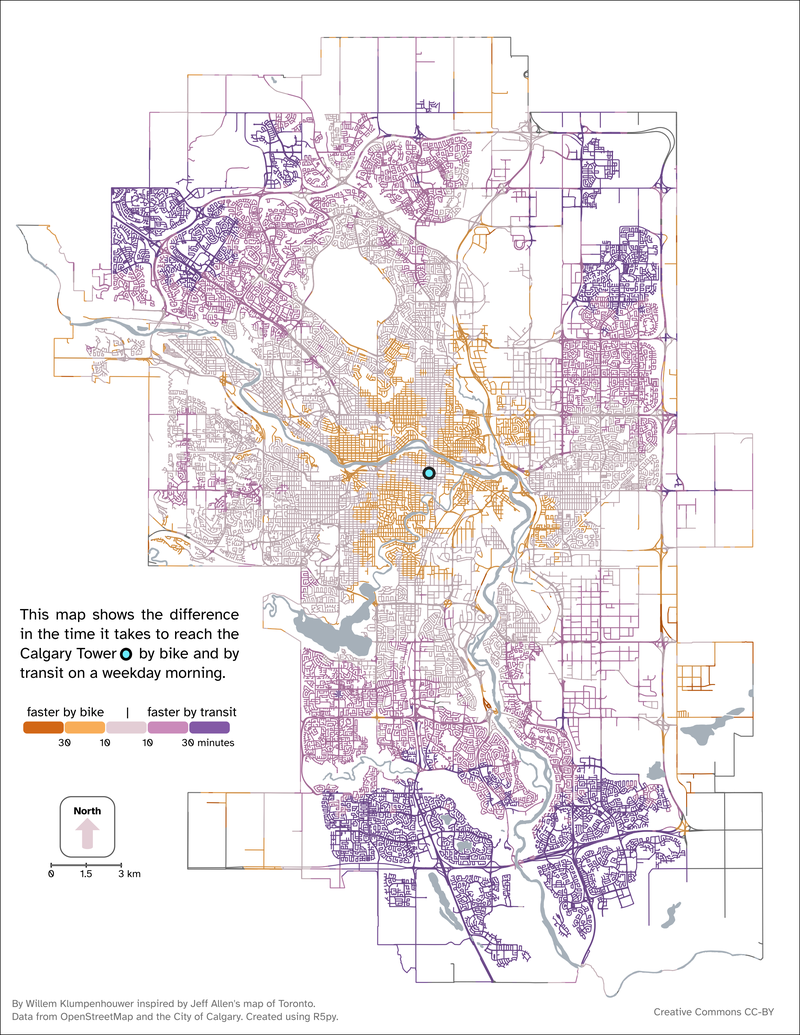
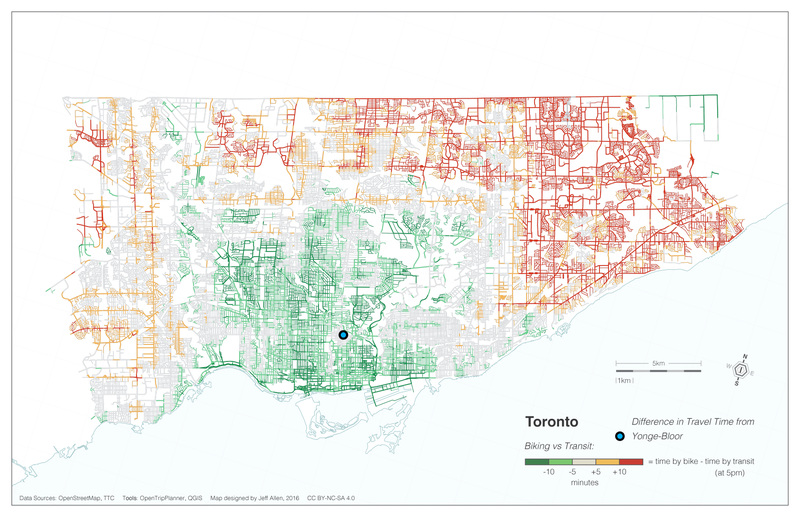
So, I set out to make a Calgary version. Effectively, I wanted to ask: When is it faster to bike or take transit to downtown? Downtown in this case was represented by the Calgary Tower; and in Toronto is represented by Bloor/Yonge.
Here's the map for Calgary:

And here's Jeff's map of Toronto:

Let's compare these two maps, starting by what is similar: Both maps show that transit is more competitive over longer distances; that's perhaps unsurprising, but it does mean that for longer distances and from suburban communities, the average speed of transit (including walking to the stop, waiting, transferring, and walking to the destination) is higher than an average cycling speed.
Toronto's map shows the sort of lop-sided geography that is created by the Don River to the east of downtown. You can also see the effect of the (much faster than bus or LRT) subway system where these tendrils of grey encroach on the green cycling dominance from the north, east, and west of Bloor/Yonge
The effects of rapid transit exists in Calgary too, but they are much less obvious. The most notable one is the Centre Street corridor running north from downtown, which is currently served by a huge number of buses. While the speed may not be that high (compared with an LRT), this corridor has very good frequency, which means less waiting around for the bus to come.
And then, in both maps, there are places where transit simply doesn't go. In Toronto, these are visible mostly at the very northeastern part of the map, but in Calgary these patches appear all over the city, including in some parts of communities such as Discovery Ridge in the west.
Maps like these are beautiful and interesting, but they can also allow for some specific conversation about policy and change. What would this map look like with an e-bike (at a higher speed), or if buses simply came more often in Calgary? How does the terrain affect how this map looks? How does the infrastructure in place for cycling help or hinder how easy it is to get around by bike?
Given that these maps can be make with a few lines of code and a morning of data wrangling, I hope to see more of these typs of comparisons appearing in planning documents around the world.